Copenhagen Airport
Rebranding of the Copenhagen Airport as my graduation thesis.
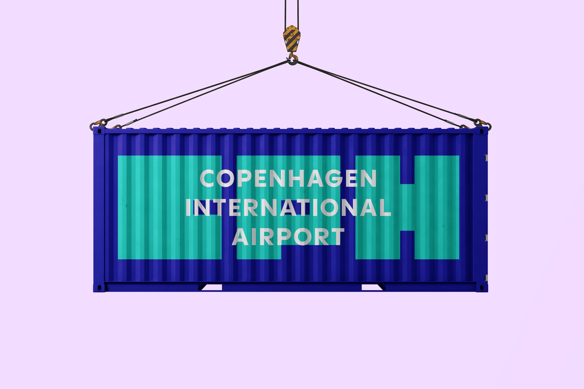
The new logo serves as a strong cultural introduction to Copenhagen by blending Danish design aesthetics with clear functionality to give tourists an idea of what to expect when they arrive.
- Year
- 2024
- Services
- Brand design, art direction
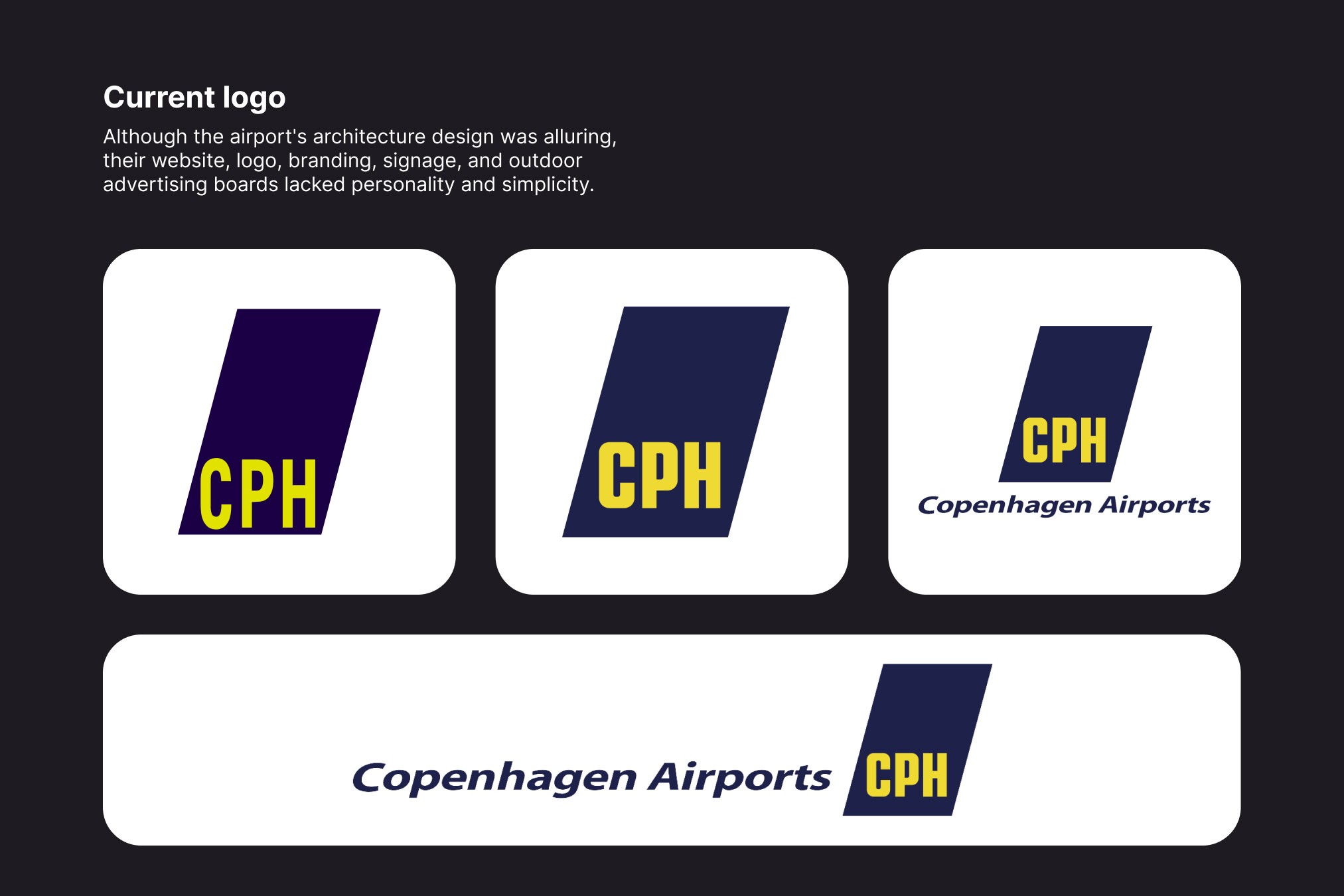
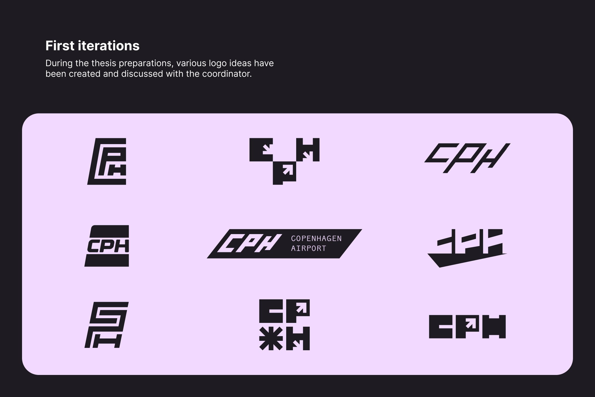

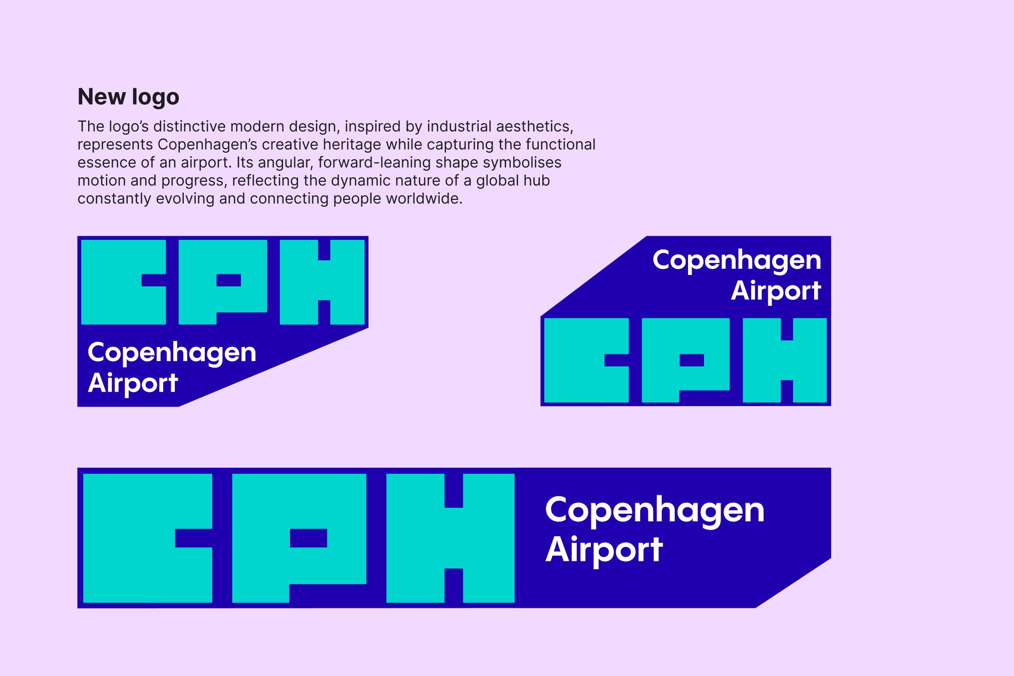
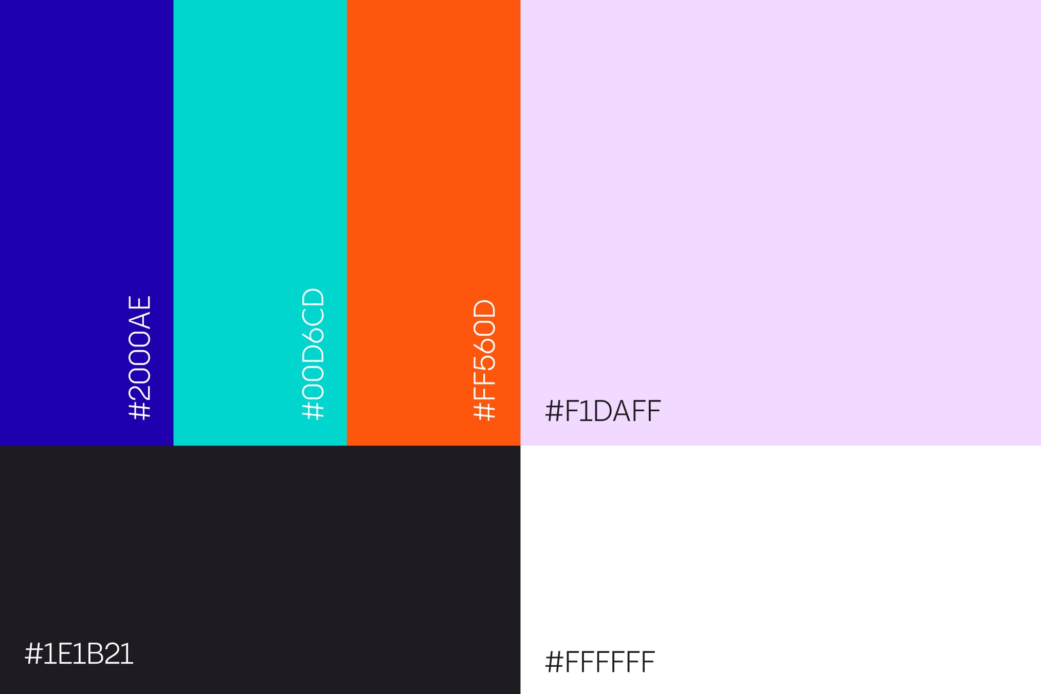

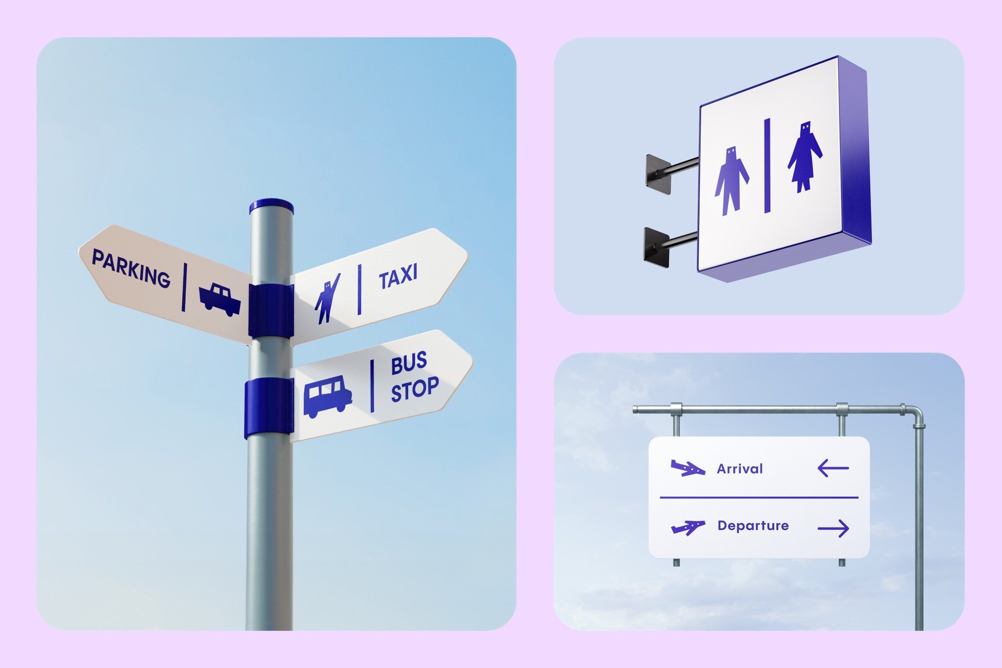
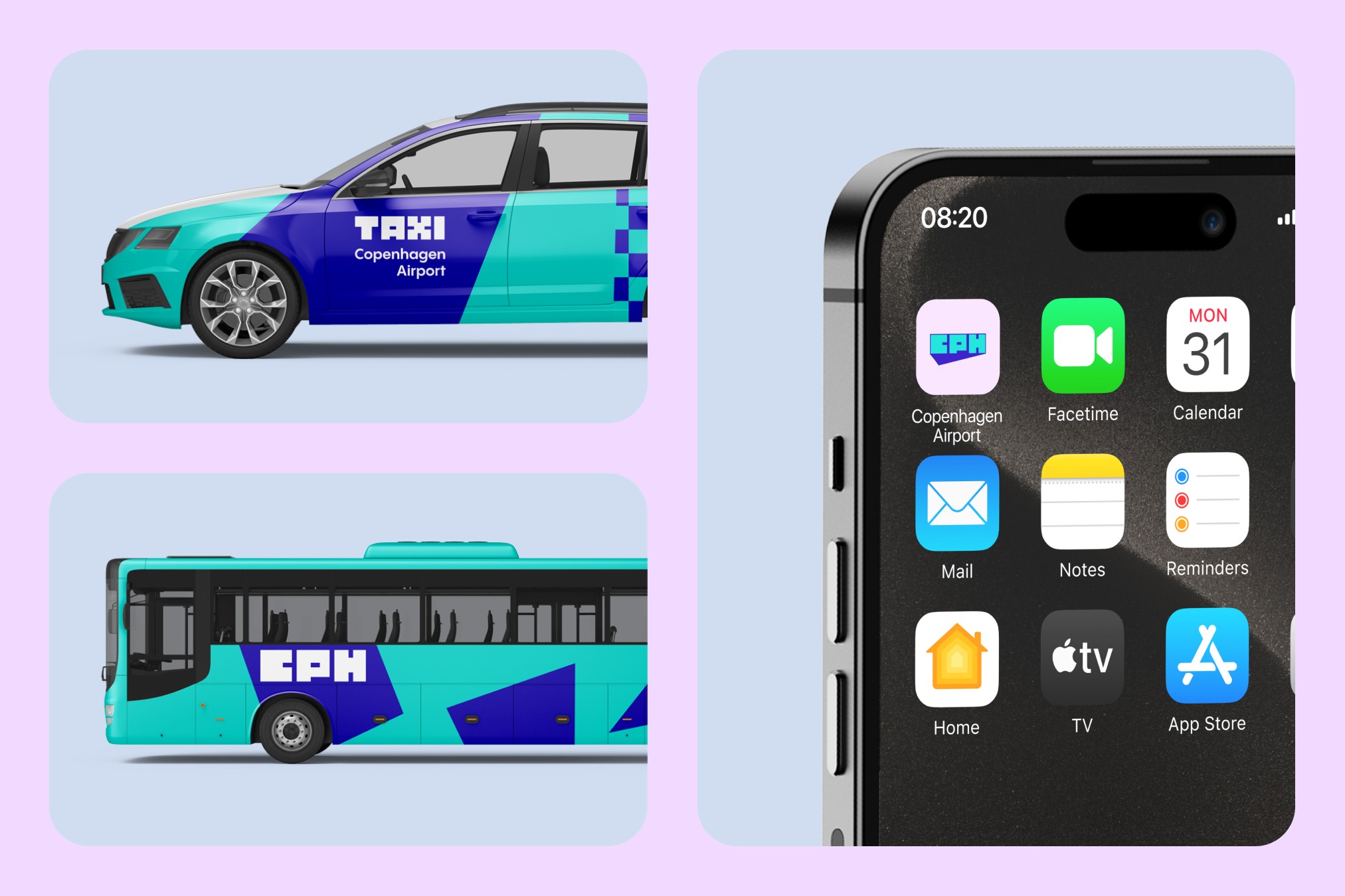


The freshly designed logo has a dynamic and adaptable graphic approach. Deep blue and vivid turquoise make up its colour scheme, which provides visibility and beautifully blends with the city’s identity. The animated parts of the logo added a dynamic quality that represents the sense of motion and adaptability that are common in airports. In addition to renewing the airport’s identity, the strategic redesign sets a fresh standard for how airports can use branding to strengthen their function as entry points to their cities.